


Termo Union. Rebranding
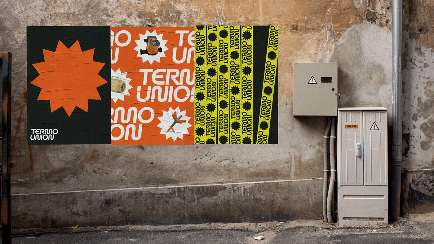
Termo Union — a network of heating and water supply stores. The main stores are located in places that are oversaturated with outdoor advertising - district centers and small-scale trade sectors.
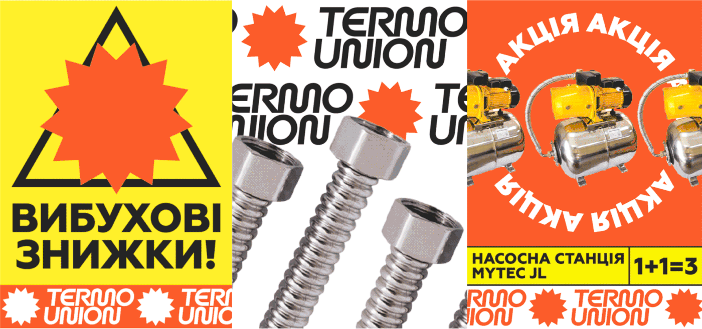
We were inspired by the aesthetics of the ukrainian “market” communication. Each store on the market copies the style of German companies, believing that it will look reliable and arouse customer confidence.
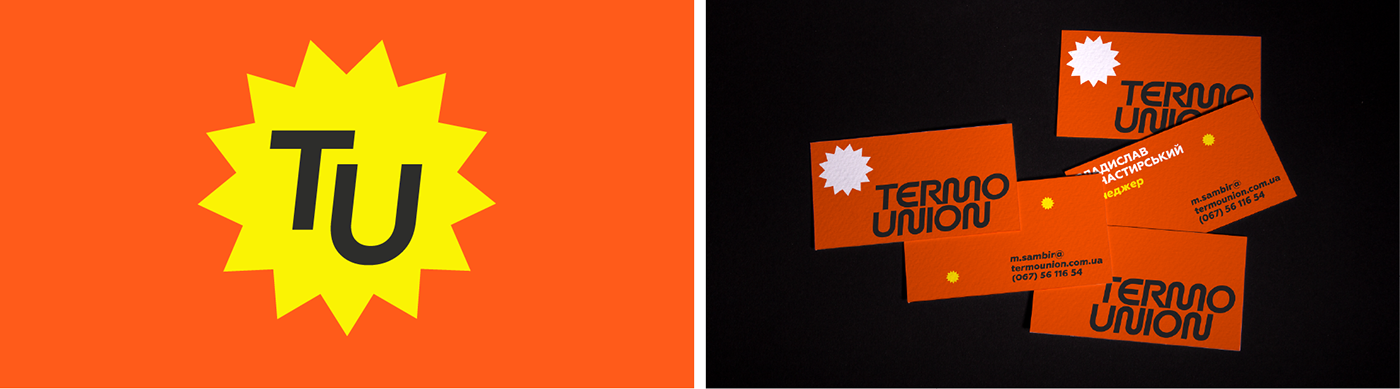
Our approach: minimum of tediousness, maximum of emotions. We communicate simply, show everything as it is. We made a strong logo, the letters of which resemble pipes, and one of the identity elements is an asterisk that communicates both “thermo” and “union”.


The Very Best of Corporate & Brand Identity. Project: "Termo Union"
Strategy director: Oleksandr Topolnytskyy
Art direction: Mykhailo Kuspys, Petro Nahirnyy
Design: Mykhailo Kupys, Anna Vyrstiuk
Photo: Mykhailo Kuspys, Anna Vyrstiuk
Photo: Mykhailo Kuspys, Anna Vyrstiuk
Project manager: Yuliana Kovaliuk


